How do you read the Leaderboard and Health chart?
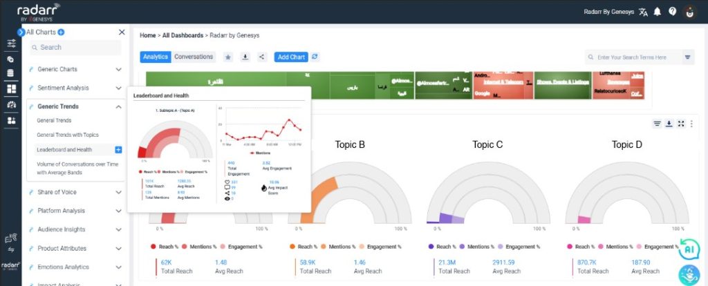
The “Leaderboard and Health” tab is located in the “Analytics” section of the platform and can be added to any dashboard of your Radarr by Genesys platform by clicking on the “Add Charts” button.

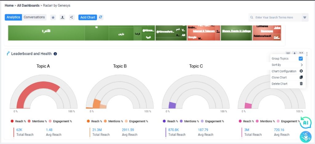
The “Leaderboard and Health” charts help you quickly see an overview of how your topics have been performing or their health. These charts can be generated for each of your sub-topics or topics as selected. The visuals can be grouped to only show you topic level analysis by clicking on the “Group Topics” option at the extreme right top corner of this chart.

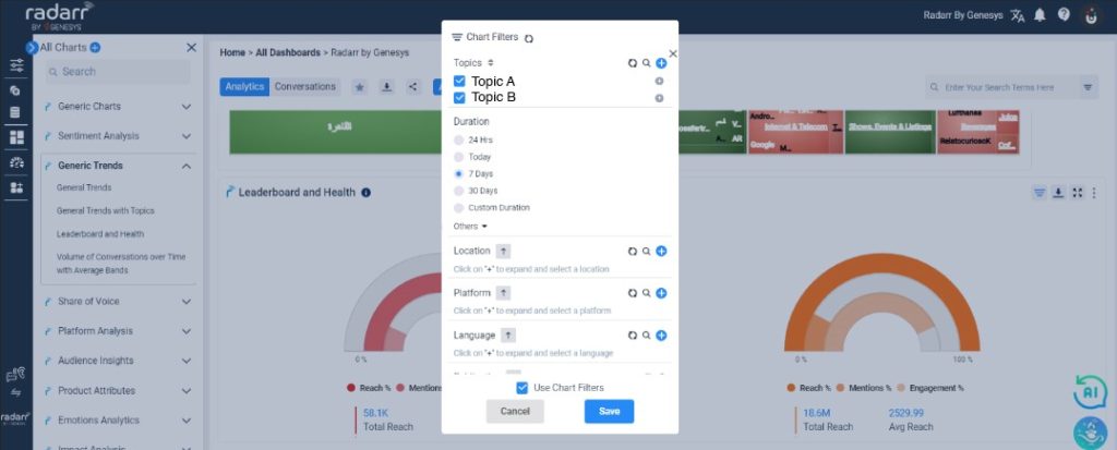
To do so, select the filter that you want to be displayed in the above chart.

Each of these charts will allow you to see the following metrics per topic as selected:
- Total Reach
- Average Reach
- Total Volume of Mentions
- Average Mentions
- Total Engagement
- Average Engagement
- Average Impact Score
- Individual Engagement Metrics:
- Likes
- Comments
- Shares
- Views
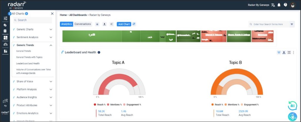
Please note that the percentages and volumes that these rings represent are in relation to the other topics as selected.

Eg. if two topics are selected such as “Topic A” and “Topic B” for generating these charts, each of the rings’ volumes/percentages will be in relation to each other i.e “Topic A” will be compared against “Topic B”.